Monday, October 12, 2009

HighEdWeb Great Keynote Revolt of 2009 - Analysis

I've decided to do a bit of analysis of the backchannel during the 2nd HighEdWeb Keynote, in order to provide a little better understanding of what went on. Dave Ferguson has already done a bit of this.

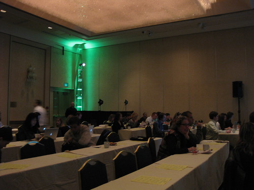
First of all, in the hour from 11:59 to 12:59 (the keynote ended around 12:51) there were 536 tweets with the #heweb09  hashtag according to What the Hashtag. Of those, I counted 488 (91%) that were related to the keynote or the discussion of the keynote.

There were, according to my count, 155 retweets, 140 of which were about the keynote.

HighEdWeb 09 2nd Keynote Tweets

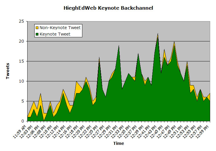
Virtually all tweets after 12:20 were about the keynote, and the peak of tweeting came at 12:43 with 22 tweets.
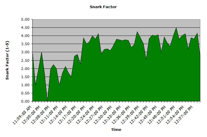
The "Snark" Factor

One thing I wanted to look at was the nature of the tweets during the keynote - were they positive, negative, respectful, disrespectful, etc.

In looking through the data, I didn't find a single tweet that could clearly be classed as possitive toward the presenter, so I was forced to skip that evaluation.

Then I went through and assigned a subjective 'snark' score to each tweet, where 1 = factual tweet with no sarcasm or criticism, and 5 = completely sarcastic/critical tweet, bordering on personally disrespectful. Here are a few examples:
1: Galper: "e-mail from a trusted source is the best way to communicate with students" #heweb09
2: How old is this presentation! #heweb09
3: I think it's safe to say David Galper won't be checking Twitter #heweb09
4: We need a drinking game for everytime he says "actually" and "actionable". #heweb09
5:OMG ICQ!!!!!!!!!!!!!!!! #heweb09 i heard its still big in uzbekistan
Acknowledging that the scale is subjective, I assigned a 'snark' value to all 488 keynote related tweets. The chart below shows the average 'snark' score for all tweets during each minute of the keynote.

snark

The second chart shows the number of tweets each minute by 'snark' score, where 5 equals the most critical and sarcastic tweets.

snark2

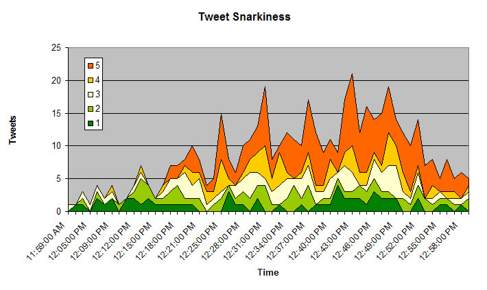
Note how the 'snark' factor rapidly rises after about 12:15, indicating that the speaker got nearly a third of the way through his presentation before the audience turned on him.

This paints a somewhat different picture than some of the commentators who weren't there indicate. Some have suggested that the Heweb09 audience was out for blood, but this analysis suggests that they actually waited until 15 minutes before turning on the presenter.

By that point, the audience had already been subjected to two extremely loud and confusing (irrelevant?) videos, a plug for a company no longer in existence, and a lot of talk about outdated technologies. Rereading the tweets, and having been at the keynote, it's possible that what might have finally sent the audience over the edge was a particularly egregious slide that was packed with dense paragraphs of texts. Or it could have just been the aggregate weight of how out of touch this speaker was with his audience and how out of date he was with his materials.

Regardless, after 12:15, the tweets began to get more and more critical and sarcastic:
12:17 - Best keynote EVER #sarcasm #heweb09
12:17 - Are you serious right now? I feel like an alternate universe. #heweb09
12:19 - David Galper, ur doin gr8, and ima let you finish, but @jmspool had one of the best keynotes ever! #heweb09
12:25 - Would he like the immediate feedback of us all walking out? #heweb09
12:25 - *insert ROLFcopter here* #heweb09
And by 12:28, someone suggested, "Can someone live-Kanye this guy? @fienen? #heweb09", effectively recommending that someone tell the speaker to shut up.

Friday, October 9, 2009

Takeaways from the Great Keynote Revolt of 2009

By now, the HighEdWeb "Great Keynote Revolt of 2009" has been commented on by a number of writers, including  Dave Ferguson (and here), Denise Graveline, Silicon Beach Training, Michael Fienen, and several others. I'm not going to go into the keynote directly, even though I was there. If you want background, read these posts or the transcript (beginning at 11:59AM).

I want to talk about something different. I want to talk about the keynote as a social experience.

Soon after the keynote began, @stomer commented:
conspiracy theory about the keynote: it's a test of the power of the back channel; social experiment. #heweb09
And what a social experiment it was. We were there as an audience, to participate by listening attentively to the presenter. But since the presenter failed to engage us, we turned our attention to the backchannel and began to partcipate with each other. But what we were participating in was not what the speaker was intentionally sharing.

The strange thing about that keynote was that it was the high point of the conference for everyone who experienced the backchannel. Not only that, it was a shared experience that bonded us together. I think that we all felt closer to each other by sharing that experience, by sharing our reactions with each other during the keynote, and by being able to share our thoughts and feelings with each other afterward.

It set the tone for the party that happened that night, and I know that we had a higher energy and a closer bond than we would have without that keynote. We all talked about it over and over that night, and it became a shared inside joke that anyone in the conference could refer to and that everyone would immediately understand.

The bottom line was that this was an intense shared experience that brought all of the attendees closer together, not entirely different from the way that survivors of a shared tragedy are often bonded.

Regardless of how I may feel for David Galper, I think that for the conference and for the conference attendees, this was an almost universally positive experience. Where before that keynote we were 450 mostly strangers, after it we all had something we had in common that we could connect on. I met and spoke to more new people in the day after that keynote than I had in the two days prior to it.

In the end, no one will remember my talk on redesigns three years from now, but everyone will remember the "Great Keynote Revolt of 2009". And they will remember it in a very positive way... in the way of how 450 mostly strangers came together in the backchannel to learn that they held common views and feelings and were able to share them with each other. It joined us and humanized us to each other in a way little else could have. In the end, regardless of any of the other presentations, this will probably be remembered as the best HighEdWeb conference ever.

You may be horrified that we would take that away at the cost of that poor man's ego, but I doubt many people there feel that way. If he was ridiculed, it was because he was in no way prepared to present to this audience.

The big takeaway of all of this for me is this: to make an event like this a true success, you have to find a way to bond people together in the experience of that event - to make that event a milestone in their lives. David Galper did that better than anyone I have ever met. It's only unfortunate that he did it unintentionally.

Thursday, May 7, 2009

Voices That Matter Web Design Conference - Part 3

Thursday

Breakfast with the Authors
The last day of the conference started off with a breakfast with the authors. I chose to have breakfast with Steve Krug, author of Don't Make Me Think. Jared Spool also joined us. Having a one-on-one conversations with minds like this was worth the cost of the entire conference. Seriously. These guys know their stuff.

Steve noted that a thousand universities have prototyped every possible design and site organization for us. If we want to see what works, we should do usability testing on their sites. And in fact, that's exactly our plan. :)

Jared Spool was pretty adamant in his assertion that all redesigns are a mistake and a failure... not overly helpful considering that we're in the middle of ours. His recommendation is to only do bits and pieces at a time, and effectively that's what we're doing, since we're only tackling our top level pages.

He also asserted that people never WANT to search. If your site is properly organized, people will always browse before searching. I don't buy that, personally, but hey, it was a great breakfast anyway.

Keynote: Cooking Up Gourmet User Experiences on a Fast Food Budget - Jared Spool
Fascinating and entertaining presentation by Jared Spool, partly about Julia Child, the absurdities of the TSA, and the fact that every university web site has photos of smiling girls under trees.

Actually, his talk was more about a usability approach using cheap tricks rather than expensive methodologies. His point was that knowing a few good tricks is generally just as good (if not better) than developing an extensive methodology. A plumber uses a wrench as a hammer and gets the job done instead of spending money on a special tool just for that job.

Very thought provoking presentation.

Take-aways: Good enough is good enough. "Organizations that are risk adverse produce crap." Learn from others and adapt; there's no need for expensive tools when a few well-honed tricks will do the job.

Learning to Love Tension, Disruption and Chaos - Russ Unger, Carolyn Chandler
This wasn't really the presentation I was hoping it would be. I was hoping that it would be more about tension, disruption and chaos in the redesign process, but it seemed a bit more scattered. I guess I just didn't connect to this session.

Neuro Web Design: What Makes Them Click? - Susan Weinschenk
OK, this presentation blew my mind. Susan talked about people react to pages from a neurological perspective. Tons of fascinating information. User testing has shown that no matter how items on a page are organized, users will click the first items more than all others simply because it is first.

Stories connect with people more than anything else, because they create empathy, and stories with pictures are even more powerful. For us, that means that we're on the right track with having stories on our main landing pages. Cool.

Fear of loss is a powerful motivator, which is why we react to "Only a few left! Order now!" Overall, food, sex and fear are our three biggest neurological motivators. Taking advantage of those is a positive on any site (where appropriate).

I got more new information out of this session than any other.

Take-aways: There is a whole different way to think about - and affect - the user experience based on our innate reactions to things. We react to things at a very primitive and visceral level, and understanding that can be to our advantage in building the user experience.

Here's a link to Susan's blog.

Summary

After a slow start, this conference really took off, and I started to see why people were so excited about it. When I left, my brain was full. I had a great time and brought a lot of useful information back to our campus.

Though I doubt that I'll be able to go back next year, I'm hooked. This is certainly one of the best web user experience conferences out there, and well worth the price of admission.

Tuesday, May 5, 2009

Voices That Matter Web Design Conference - Part 2

Days two and three were full of great presentations. The interesting about this conference was that the sum of all the sessions taken as a whole was much greater than the individual sessions. I went from being disappointed on Tuesday to overwhelmed on Thursday.

Wednesday

Keynote: The Designful Company: Marty Neumeier
I'm not a designer, so this session wasn't really directed at me, but this was a fascinating discussion of design as more than graphic design and branding. Design is an entire approach to everything from the way a company is run to the way decisions are made to the end user experience.

One Twitter comment was pretty much to the point on this: "right now 'design' sounds like magic pixie dust that you can sprinkle on anything to make it better". You could almost substitute "project management" or "planning" for "design" and make the same points.

However, the designers I talked to thought this was a highly inspiring session.

Content Strategy, UX and the Real World - Kristina Halvorson
For me, this was the single best session of the conference. The main reason I loved this session was that it validated all that I'm going through with trying to wrap my head around dealing with the complexities of getting content for our new home page redesign.

Getting content for a site isn't as simple as creating a box on a flow chart saying "content comes in here". Content drives information architecture and information architecture drives content. Content is an iterative process, involving all team members and stakeholders.

The only way you'll succeed in getting the best content is to plan a content strategy around specific goals that you want to achieve.
  • Plan
  • Create
  • Publish
  • Govern (rinse, wash, repeat)
She provided some great examples about how less content is more: more focused, more maintainable, more on message.

However, she also made the point that taking a content inventory was critical to success. Ugh, that's a hell of a lot of work - mind numbing but necessary.

Take-aways: Content is a process, not a feature. A content strategy will help you avoid the pitfalls of delayed content, scattered, off-message content, etc. We need a clear content strategy statement to help us manage the content for our redesign.

What I Have Learned So Far in the 21st Century - Steve Krug
Steve Krug is the author of the single best web usability book out there: Don't Make me Think. This was a fun presentation. Steve's a great guy. Overall, Steve says that he hasn't really learned a lot about usability in the 12st century that he didn't already know, but there were a few nuggets.
  • If people need to see something, don't be afraid to shout (make it really stand out)
  • Fix the top 3 worst usability problems on a site first, before tackling any 'low hanging fruit' problems
  • Make the smallest change that fixes the problem - don't redesign a page just to fix one issue
  • http://usertesting.com, http://clicktale.com, http://silverback.com are good tools for online user testing

Beyond Web 2.0 - Jesse James Garrett
Another heavy hitter, Jess James Garrett, author of The Elements of User Experience, takes on Web 2.0. Actually, he pretty much dismisses Web 2.0 and focuses on the user experience instead. "The experience is the product." The main focus of his presentation is to continually simplify the user's experience. Examples of MS Word with all the tool bars open and a video Microsoft made about Microsoft redesigning the iPod packaging (hilarious!)

Take-aways: The user experience cannot be too simple or too easy. Simplify! Simplify!

Stump the Chump - Steve Krug
Steve Krug took questions from the audience about usability. Unfortunately - or actually fortunately - the first five names he picked were people from Berkeley!

Take-aways: University sites are fundamentally different from other sites. Audience segmentation is normally bad on sites, but appropriate on university sites because people self-identify and there is typically little overlap in roles.

Overall, this was a fantastic day. I'll cover the third and final day tomorrow.

Monday, May 4, 2009

Voices That Matter Web Design Conference - Part 1

I know that I have been horribly ignoring this blog in favor of Tales from Redesignland, but with all the work on the actual redesign, I haven't had the energy to do both.

However, last week I went to the Voices That Matter Web Design conference in San Francisco, and I thought that I'd file a report. I'll probably be talking about specific sessions in more detail later, but I wanted to give a summary of the sessions that I went to.

Voices that Matter is an imprint of New Riders publishers, and all of the presenters were authors, including some big names like Steve Krug, Jesse James Garrett, Jared Spool, etc.

Overall, the conference was pretty stunning, and by the end my brain was full.

People Filing in:
Voices that Matter Web Design Conference

Other photos (not mine) from the conference.

Tuesday

Keynote: Marketing Obama: Social Media Gets a Seat at the Table - Rahaf Harfoush
An interesting look inside the Obama campaign, but to me it provided little in the form of take-aways regarding the use of social media.

Sorry. Web 1.0 Is No Longer Supported - Joel Postman
More a history of web-based social media than anything else, so it was a bit disappointing. Very interesting discussion on flogs, splogs, blogola, astroturfing and other shady practices in the blogosphere. Shorttask is an very interesting example, where you can get paid 5 cents to post a positive comment on a blog post.

Take-aways: People aren't particularly nice on the internetz.

Free Range Content: Unlock Your Ideas to Increase Your Reach - Aarron Walter
I was the most disappointed in this session, not because it was a bad presentation (it was actually very good), but because it was nothing new to me. RSS and Flickr... yeah, I've heard of them. I was more interested in content strategies than learning how to reuse existing content.

Take-aways: Content can be used more than once in one place.

The Trusted Filter: Designing for Credibility - Jason Cranford Teague
This presentation was all about how to gain and hold the trust of your site's visitors. For me it seemed a bit fragmented.

Take-aways: Not really sure.

So, Monday was the weakest day, and I was feeling that (beside the fact that like only two people were Twittering) it was pretty lame at this point. But Wednesday and Thursday were night-and-day better... and they'll follow in part 2.

Wednesday, November 19, 2008

Home Page Elements - Installment 3

Every year I take a look at a number of newly designed university home pages and break down their component elements. Last year's analysis is in this post.

This year, I took 15 university or college home pages that had been redesigned within the past year (as posted on eduStyle.net) and had received more positive than negative votes.

Most Common Page Elements

The most notable changes here are the continued climb of events/calendars, and the decline of top banners.

Element Sites 2006 Sites 2007 Sites 2008
Photos 100% 100% 100%
Primary Navigation 100% 100% 100%
Search Box 100% 94% 100%
News 85% 83% 93%
Events 30% 67% 87%
Secondary Navigation 70% 78% 73%
Feature/Spotlight 55% 78% 73%
Top Banner 90% 78% 60%
Quick Links 45% 22% 33%


Page Element Placement

Once again, no huge changes. Some of the overlays look a bit different since I was using a bigger monitor this year to capture the screenshots. Other than that, a few trends, but no major shifts.
  • Logos and brands continue to congregate more toward the upper lefthand corner
  • Primary navigation is pretty consistently below the brand, either vertically or horizontally
  • News is trending a bit more toward the center, and events a bit more further to the right
2006 is on the left, 2007 in the middle, and 2008 on the right.

Top Banner
Identity/Logo

Search Box

Primary Navigation

Secondary Navigation

Main Photo

Other Photos

Feature Item

News

Events/Calendar

Quick Links

Friday, July 25, 2008

Twitter, Twitter, where art thou Twitter?

This is in response to this post by Kyle James.

I love Twitter and use it and follow a bunch people, but I'm not sure what to make of Twitter in the sense of how "important" it is.

Is it the next email? (by which I mean life/work transforming killer app, not something that has been horribly abused by spammers) Doubtful. Email, for those of us that remember when email became part of our lives, really changed the way we worked and kept in touch with people we knew.

Twitter is not that revolutionary, though it has allowed be to befriend and converse with people I've never met and know little about (other than what I've picked up via Twitter).

Ten years from now, what will we be saying about Twitter? I think that's one way to think about the potential importance of Twitter.

Email is so useful, that despite it's flaws, it will still be here in ten years. Twitter? I doubt it, particularly if it can't address it's stability and downtime issues. Something better will come along and replace it.

Will Twitter ever reach the critical mass that email has? Doubtful again. How many people can you follow in Twitter before so much scrolls by that you never see? If more and more people use it, the streaming nature of Twitter will work against it.

Email lets you deal with it at your own pace. Emails don't go anywhere. Technically, neither do tweets, but the nature of tweets is in the now. Two day old tweets are... not interesting. Two day old emails may be interesting, depending on what they are.

What, fundamentally, is the purpose of Twitter? You tell me:
  1. Vital communication tool
  2. Way to keep in touch with friends
  3. Way to feel connected to a virtual community
  4. Instant vanity publishing
  5. Strange combination of communication and instant gratification
  6. Way to waste time by watching other people's lives
  7. All of the above

Thursday, June 26, 2008

The Good, the Bad and the Ugly, Part 1 - Humboldt State University

Part 1 in series analyzing the good and bad things about a variety of university home pages.

As I've mentioned before, we at CSU, Chico are just beginning the process of 'redeveloping' our top level pages (I hate the word 'redesign' because it doesn't convey the entire scope of the process - which encompasses a lot more than a new graphic design).

As part of that process, it's vital to understand what works and what doesn't on other university Web sites.

I'm starting with Humboldt State's Web site because it does so many things so well.

Consistency

Consistency is a big issue with any university Web site, due in large part to the inherent autonomy that university's grant their colleges and departments. At many schools, each department has complete control over the design and organization of their site, and they may even maintain their own Web servers. Lacking central control and branding authority, university sites tend to devolve into a mishmash of designs.

Humboldt State's site is no different, but they've managed to at least create a top tier of pages that present a basic design and organizational consistency.Even though the main navigation moves around a bit, all pages have a similar simple layout and design that clearly communicates that you are on the Humboldt site.


Navigational Grouping

The worst kind of navigation is the kitchen sink kind, where everything is just randomly dropped into a long list, with no grouping of similar items or any thought to organization.

Humboldt has clearly thought out their navigation with the goal of keeping it simple and clean, without overwhelming users with too many choices.

There are four navigational regions on home page:
  1. Alphabetical Index
  2. "Main" navigation
    1. Admissions
    2. Majors & Programs
    3. About Humboldt
    4. Living Here
    5. Athletics
  3. Audience-oriented navigation
    1. Future Students
    2. Current Students
    3. Parents & Families
    4. Faculty & Staff
    5. Alumni & Friends
  4. "Recruiting" navigation
    1. Explore
    2. Inquire
    3. Visit
    4. Apply
Each navigational area is clearly defined by its position on the page, the white space around it and even by using different fonts and font sizes for each region.


Messaging

One of the things I think that Humboldt's home page does best is communicate a clear message to users, particularly prospective students. This is done through the photos and stories on the home page.

As I've discussed in previous posts (here and here), home page photos should communicate something specific that is different or special about your school, and ideally, they should have a context (like a story). Humboldt's site excels at this.

You can see all of their home page photos and stories on this page. Of the 14 photo/stories:
  • 4 relate to outdoor activities
  • 3 relate to environmental issues
  • 3 relate to social activism
  • 2 relate to art
Those are clearly the main selling points of Humboldt State and it's region, and the message is clear: if you're interested in the environment, outdoor activities, social activism or art, Humboldt is the place for you.


Audience Prioritization

40% of the entire home page is dedicated to the photos and the links designed to grab the attention of prospective students. If you include the main navigation (which is aimed primarily at prospective students) and the News and Events sections (which might be of interest to prospective students), 64% of the home page is directed toward prospective students.

Is this good or bad? I guess it depends on how you define the goals of your home page, but recruiting new students has to be one of your top priorities.


Dedicated Temporary Content Region

One issue CSU, Chico's site has is dealing with temporary content or links that need some prominence. Though we have a space for announcements, we don't have a place to highlight special news or events. Humboldt dealt with this issue by dedicating the lower right-hand corner of the home page to eye-catching graphical announcements that change periodically.


The Bad and the Ugly

I don't have a lot of complaints about the Humboldt site. Most of my criticisms are minor nit picks like moving the navigation on interior pages, occasional pages with excessive chattery text (example), moving the search box to the bottom of interior pages, etc.

Final Score


I love handing out grades. I makes me feel like I know what I'm talking about.

1-10 scale

Design 9
Usability 9
Branding 8
Messaging 9
Organization 8
Navigation 9
TOTAL 52

Thursday, May 1, 2008

Lou Rosenfeld on the Redesign Process

Great presentation by Lou Rosenfeld (of O'Reilly's Information Architecture fame) on the university Web site Redesign process, titled "Redesign Must Die".

Just a couple of nuggets:
  • "Every time you redesign, God kills a kitten."
  • "Ban the word 'Redesign' at your next meeting."
He even uses one of my Tales from Redesignland cartoons!

http://www.slideshare.net/lrosenfeld/redesign-must-die-381947/

Monday, April 28, 2008

The Redesign Process - Step 0

Rumor has it that our university is about to begin the process of redesigning our home page. That's the 'future endeavour' that the title of this blog refers to... and it's about to begin! The first meeting of the new "web content committee" (bad name, I know) is scheduled for this Friday.

Praise the Lord! But...

But, as we all know, if the process gets off on the wrong foot, it will very difficult to correct things and snatch success out of the jaws of failure.

Here's just one example of how we could get off on the wrong foot: "I've never liked the gold stripe on the home page. Whatever we do, we should get rid of that."

If that's the way things start, success will be very difficult to achieve. Why? Because arguing about design details that are based solely on personal opinions leads nowhere and can accomplish nothing positive.

The truth is that "design" (i.e., graphic design) is actually a very small part of the redesign process (no offense to graphic designers).

The real work of redesign isn't as simple as blurting out your uneducated opinions on color and layout.

The real work of redesign is more about realigning your site to better meet your users' needs and your university's goals, messaging, branding and strategic priorities than it is about flash animations and pretty pictures.

Build the House Before you Hang the Drapes


Think of the Web site redesign process like building a house. You can't hang the drapes before you build the walls, and you can't build the walls until you have a floor plan, and you can't draw a floor plan until you know the needs of the family that will live there.

Likewise, you can't choose the design elements before you've built a wireframe of the site, and you can't build a wireframe until you've developed an information architecture for the site, and you can't develop an information architecture until you understand the needs of your users and the goals your organization has for the site.

So step one cannot be a discussion of your opinions of the existing site or what you think should be in the new site. It should be all about asking questions. Here's just a few:
  • Who are our users?
  • What do they want on the site?
  • What do they do on the current site?
  • What do they like about the current site?
  • What do they hate?
  • What problems do they have with the current site?
  • What/who are we competing against?
  • What are they doing?
  • What do our users like about other sites?
  • What are our goals for the site?
  • What do we want our home page to accomplish and for whom?
  • What is our brand and how will that be applied to the site?
  • What is the message we want to communicate on our home page?
  • Do we even have the proper stakeholders involved in the process?
Notice that your opinion doesn't appear in any of these questions. That's because at this phase, it isn't about you (sorry!). It's about beginning the process of aligning your institution's goals to your users' needs.

Once you start to ask these questions, you'll realize that you need to gather some actual data and talk to some people in order to get answers to these questions.

That will be the topic of my next post.

Tuesday, April 1, 2008

Chico's New Online Photo Catalog - Likes and Dislikes

In my other life, I'm a professional photographer, with several Web sites (here and here). So when our department decided to put our internal photo catalog online, I was volunteered (er...recruited) to do the development for it.

I have a lot of experience with stock photography sites (since my work is carried by several - excluding royalty free and microstock, may Allah strike them dead in His infinite mercy), so I know what I like and dislike in online photo sites.

Now, I didn't shoot any of these photos; that's not my job on campus, but we do have a staff photographer who does official campus photography for everything from faculty portraits to events, receptions, general publications and the University Catalog.

The backend of the catalog uses Portfolio 8.5 server. For my personal business, I use iView Media Pro, but Portfolio is pretty similar overall. Both have pros and cons, and I'll refrain from Portfolio bashing.

Initially, we had a lot of problems with hardware, permissions and networking, but once we resolved all that, I was able to begin work on the Web front end. We went with the built in NetPublish tool which uses a JavaScript-based API. I've decided that I like it.

Even though it's still in serious beta mode with lots of missing pieces and content (particularly payment and policies), you can look at it here: http://images.csuchico.edu.

What I Like

It seems a bit weird to review a site that I developed, since mostly I pick at other people's sites. It also seems like tooting my own horn a bit to say, "Look at this site I did! I think it's really cool!!"

But I actually do like this site. I just wish I had time to redo my business sites to match.

OK, so here's what I like...

Number of Results per Page
You can change the number of results that you view per page. Though the default is 16, I like to view as many photos as I can on a single page. Oh, and it remembers your preference from search to search, but only for the current session (Portfolio limitation).


Dynamic Page Width
I hate static width layouts of image thumbnails. I have a 1600 pixel wide monitor at home and two 1280 pixel monitors side-by-side at work, so why can't I use all that space to look at thumbnails? With this site you can. I just organized the thumbnails in divs so that they automatically wrap to match your browser window's width. Cool!


Pop Up Image Previews
We used OverLib to pop up image previews when you roll over each thumbnail. An awesome way to quickly browse through photos. I used the Portfolio NetPublish API to add some pertinent info to the pop up. No more having to go to a separate page to see larger versions of each photo. Super cool!!

Popup Image Information
Our graphic designer was particularly worried that people will want images that aren't big enough to be reproduced well at the size they want in the medium they want. We went around a bit on the best way to do this. I ended up adding an OverLib popup that calculates the dimensions that each photo can be used at different resolutions. It's simple and clear, but doesn't take up space on the page.


Bigger Previews
If you want to see an image even bigger, and view even more detailed info (such as EXIF data, exposure data, etc., if available) on the image, you can click on it and go to a detail page. Nice to have.


Thumbnail Pop Ups on Check Out Page
I hate stock sites that don't let you see what you're buying on the check out page. I also hate stock sites that show a huge list of thumbnails on the check out page - it just makes the page too long when you have to scroll and scroll to see your total cost at the bottom. So I used OverLib to make pop up thumbnails.


Issues

OK, it isn't perfect. Here's a partial list of what still needs work.
  • We still have problems with vertically-oriented RAW images not being rotated correctly (that's a Portfolio limitation)
  • We still have a lot of missing previews (they have to be rebuilt manually)
  • The left nav menu is static, so there are a lot of categories listed that currently have no photos in them.
  • OverLib does a weird flickering thing sometimes that drives me nuts
  • We still have a lot of crappy images cluttering up the catalog
  • We need better keywording (we're working on that)
  • We're still fine tuning the advanced search (Portfolio's search is limited and not very smart)
You might not like that there's no automatic download, but we really can't allow that since there are a lot of photos of staff and faculty that shouldn't be freely available. And anyway, the idea here is to try to bring in a little money from departments on campus for the use of photos that we took.

Let me know what you think.

Thursday, March 27, 2008

Accessible Instructional Multimedia: Live blog from CATS 2008

AIMs are online multimedia resources that demo to faculty the use of accessible technologies in teaching.

AIMs enable faculty to understand the ways that emerging technologies can be used to support student success.

Project supported by EnACT to help faculty and staff to develop accessibility training resources to help faculty learn about incorporating accessibility into their course materials... or at least I think that what's this is about... actually, not all of them are about accessibility, but most are.

AIM projects are added to MERLOT repository. Most appear to be videos.

Total of 40 projects planned from eight CSUs... 6 from Chico... wOOt!

6 completed to date, 13 under development.

Next round of projects... applications due in April

Topics wanted:
  • Universal design for learning
  • Assistive technology
  • Distance Learning
  • Technologies designed to address particular Instructional challenges
  • Case studies on deploying accessible course materials
  • Other topics
Examples
Then it all devolved into one guy asking a bunch of questions...